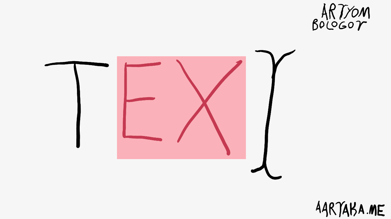
Just Let Me Select Text
By Artyom Bologov
Untranslatable Bios #
I’m lonely. Like everyone-ish else. Naturally, I’m on Bumble. (Because Tinder is a rape-friendly lure trap.) When work calls get boring I inevitably start swiping (mostly left 😢)
There are lots of tourists in Armenia in the summer. From all over the world really. Speaking a stupefying range of languages. With bios and prompt answers in these numerous languages. Not necessarily discernible to me due to my language learning stagnation.
So there’s this profile of a pretty German girl. With bio and prompts in (an undeniably beautiful) German. Speaking English, she made the decision to use her mother tongue for the bio. A totally valid choice.
So I want to know the story she tells with her profile:
- Select her bio,
- copy it,
- paste into a translator,
- look up the exact meaning of some mistranslated German word,
- and realize the unexpected poetic meaning she put into these 300 chars.
Except… I can’t do that. The text is not selectable/copyable in Bumble app. I have to do a bunch of relatively unsurmountable steps to do what should’ve taken half a minute. Like screenshot the profile and scrape the text with iOS Photos text recognition. Or use some OCR (web)app elsewhere. It’s… discouraging. Thus I give up and swipe left. A shame—she was beautiful at the very least!
Media #
By making the text in your UI non-selectable, you turn it into… an image essentially? Images, audio, video, and interactive JS-heavy pages are multidimentional media. Not really manipulable and referenceable in any reasonable way. (Not even with Media Fragments—they were turned down by everyone.) You lose a whole dimension (🥁) of functionality and benefit by going with such media or their semblance text.
Podcasts are not easy to roll back to useful part.
Video transcripts don’t make sense without the visuals.
Web graphics are opaque <canvas>-es you can’t gut.
Text is copyable. Text is translatable. Text is accessible (as in a11y.) Text is lightweight. Text is fundamental to how we people process information.
That’s why we still use text in our UIs. We want to convey the meaning. We strive to provide unambiguous instructions. We need to be understood. So why make the text harder to process and understand?
Stop It #
Whenever you disable text selection/copying on your UI, you commit a crime against the user. Crime against comprehension. Crime against accessibility. Crime against the meaning. Stop incapacitating your users, allow them to finally use the text.
But why might one even do that?
Some reasons and their rebuttals:
- Copyright—preventing content scraping
- Most of the scraping is done by bots, not humans copy-pasting text. Disabling selection does nothing to these. It only breaks users’ workflows and makes your site less friendly.
- UI clickability/draggability
- Some UIs are really interactive and need a click/drag to be unambiguous on some elements. The downside is that bug reports from users can’t reference the exact UI element that’s broken. Wording is important.
- Mimicking for native/professional apps
- So petty, going against the user in pursuit of some ephemeral image. Focus. On. The. User.